
Jetpack Compose Snackbar alternative – InfoBar Compose library
As the Snackbar available in Google’s Compose Material library doesn’t offer a quick and intuitive way to display on-screen messages, requiring multiple steps like using a Scaffold or a SnackbarHost / SnackbarHostState combo and handling coroutines, the InfoBar Compose library acts as a Jetpack Compose Snackbar alternative, aiming to provide a quicker way to display Snackbar-style on-screen messages. Moreover, it offers multiple customization options through dedicated parameters.
How easy can it be?
Firstly, include the library in your module-level build.gradle file:
repositories {
mavenCentral()
}
dependencies {
implementation 'com.radusalagean:info-bar-compose:1.0.0'
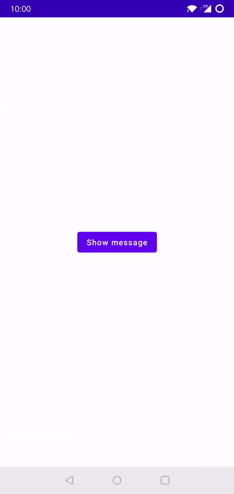
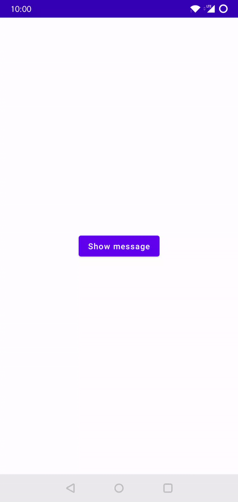
}Afterwards, Display a simple message at the press of a button:
setContent {
    YourAppTheme {
        Box(Modifier.fillMaxSize().padding(16.dp)) {
            var message: InfoBarMessage? by remember { mutableStateOf(null) }
            Button(
                modifier = Modifier.align(Alignment.Center),
                onClick = { message = InfoBarMessage(text = "Example message") }
            ) {
                Text("Show message")
            }
            InfoBar(offeredMessage = message) {
                message = null
            }
        }
    }
}
Let’s take this example and explain it step by step:
- Create a mutable state holder called
message, which is of nullable typeInfoBarMessage, andremember { ... }it, since we declare it inside a composable, initializing it tonull; - Assign the
messageto anInfoBarMessageinstance, describing the message you want to be displayed on the screen. There are multiple parameters available, ranging fromtexttoaction(if you want to have an interactive button), all the way to color-specific parameters. For now, we’ll only pass a String for our text message; - Finally, declare the
InfoBarcomposable in your UI tree. Similarly, there are multiple parameters available for you to customize, but this time we only pass the required arguments:offeredMessage– Themessagevariable we declared and assigned earlieronDismiss– Trailing lambda which is called when theInfoBaris either timed out or dismissed by the user. We always have to null out theInfoBarMessageinstance here. This is part of the contract with the library, in order to ensure the expected behavior.
Customization options
Although the previous example shows what you can achieve with the minimum effort required from you, there are also a number of customization options at your disposal.
InfoBar composable signatures
The InfoBar composable has 2 signatures:
- One for a standard version, which already has a layout defined, inspired by the Material design
Snackbar. This composable has multiple parameters exposed, allowing for increased customizability of the predefined standard layout. - One for a generic version, allowing to pass a composable layout defined in the client app.
Most importantly, make sure to check the GitHub repository readme file, for all the available options.
What about animations?
At the time of writing this article, the official Snackbar implementation does not expose ways for us to easily customize the animation type and animation duration, thus being stuck with a Fade + Scale combo timed at 150ms for the enter animation and 75ms for the exit animation. While these are the values InfoBar also uses by default, in order to feel seamless and familiar to the end-user, you also have the option to customize these aspects. Therefore, some relevant parameters for animations are listed below:
- Alter the animation type:
fadeEffect,fadeEffectEasingscaleEffect,scaleEffectEasingslideEffect,slideEffectEasing
- Change the transition duration:
enterTransitionMillisexitTransitionMillis
Using the generic composable
If the standard InfoBar signature does not entirely meet your requirements in terms of layout, you can use the generic InfoBar signature, which allows you to pass a custom layout composable. For instance, this is just an implementation example, feel free to get as creative as you want. Here are the general steps you need to follow:
1. Extend the BaseInfoBarMessage abstract class and define your custom message data structure:
class CustomMessage(
    val textString: String,
    val icon: ImageVector,
    val iconColor: Color,
    val textColor: Color = Color.Unspecified,
    override val backgroundColor: Color? = null,
    override val displayTimeSeconds: Int? = 4,
) : BaseInfoBarMessage() {
    override val containsControls: Boolean = false
}
2. Declare the content composable that defines your layout:
val content: @Composable (CustomMessage) -> Unit = { message ->
    Row {
        Icon(
            modifier = Modifier.padding(8.dp).align(Alignment.CenterVertically),
            imageVector = message.icon,
            contentDescription = null,
            tint = message.iconColor
        )
        Text(
            modifier = Modifier.align(Alignment.CenterVertically),
            text = message.textString,
            color = message.textColor
        )
    }
}
3. Display the message:
setContent {
    YourAppTheme {
        Box(Modifier.fillMaxSize().padding(16.dp)) {
            var message: CustomMessage? by remember { mutableStateOf(null) }
            Button(
                modifier = Modifier.align(Alignment.Center),
                onClick = {
                    message = CustomMessage(
                        textString = "This is a custom message",
                        textColor = Color(0xFF414141),
                        icon = Icons.Rounded.Info,
                        iconColor = Color(0xFF27C54D),
                        backgroundColor = Color(0xFFE3F1E6)
                    )
                }
            ) {
                Text("Show message")
            }
            InfoBar(offeredMessage = message, content = content) {
                message = null
            }
        }
    }
}
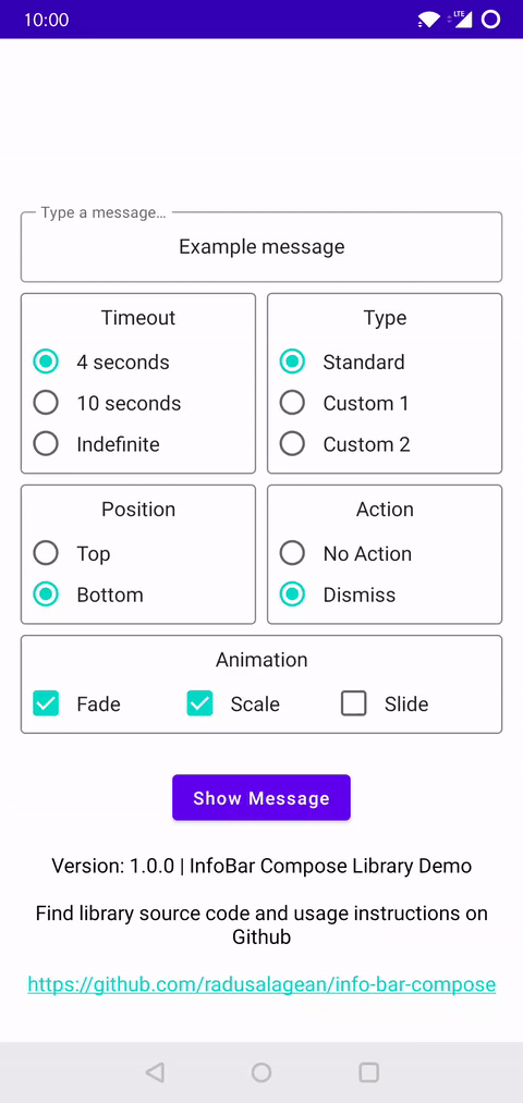
Sample app
More complex usage examples are available in the sample app. Download from Google Play and check its source code.
Conclusion
While the Snackbar implementation for Jetpack Compose offered by Google is definitely functional and works great if you use it within a Scaffold, I think the InfoBar Compose library is a decent alternative for developers who want more customization freedom, as well as for those who want to show a Snackbar-style message with minimal coding effort. If you would rather use the Snackbar instead but aren’t sure how to do it, I found a short and to-the-point article that shows you how.
I also have a free 7-Hour Jetpack Compose course* on my YouTube channel, which you can watch here.
(*Chapter 15: Info Bar laid the groundwork and the idea for this library. Starting from that implementation presented in the video, I changed it to support increased customization options, used stable animation APIs, among other improvements and offered it as a stand alone library. 😉)
If you use this library and enjoy it, please support it by starring it on GitHub. 🌟